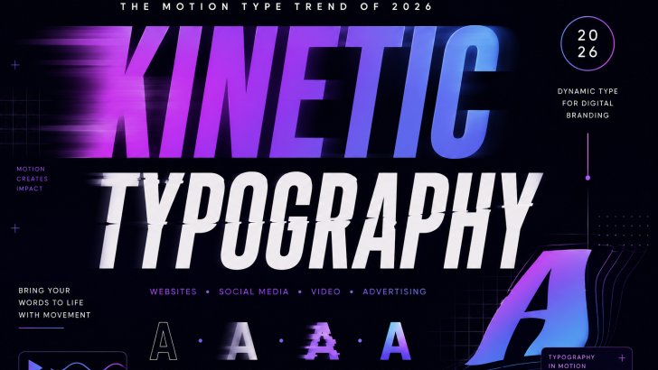
Kinetic Typography Trends: Dynamic Fonts for Digital Branding in 2026
Kinetic typography is changing the way designers use type in digital branding. Instead of keeping text completely static, designers can make letters move, transform, stretch, rotate, and interact with other elements.
In 2026, animated typography is becoming increasingly useful for websites, social media, advertising, music, video, and digital brand experiences.
The idea is simple: typography does not only communicate a message. It can also communicate movement, energy, emotion, and personality.
What Is Kinetic Typography?
Kinetic typography is the use of movement and animation to communicate through type.
A simple headline can become more expressive when letters:
- Move across the screen
- Change size
- Stretch
- Rotate
- Fade
- Appear one by one
- Change weight
- Transform into another style
The movement becomes part of the message.
For example, a word representing speed could move rapidly across a screen, while a word representing calmness could appear slowly with gentle transitions.
Why Motion Typography Is Growing in 2026
Digital branding has changed significantly.
A logo is no longer limited to a printed business card or static website header.
Brands now appear across:
- Websites
- TikTok
- YouTube
- Digital advertisements
- Mobile apps
- Motion graphics
- Video campaigns
Because these environments support movement, typography can become dynamic.
This creates opportunities for brands to develop static and animated versions of the same typographic identity.
Static Typography vs Kinetic Typography
Traditional typography communicates primarily through shape, size, spacing, and hierarchy.
Kinetic typography adds another dimension:
TIME.
A static headline might say:
MOVE FORWARD
An animated version could make the word MOVE physically travel across the screen.
The message becomes visual and temporal at the same time.
This can make digital branding more memorable.
Kinetic Typography for Brand Identity
Motion can become part of a brand’s visual identity.
A company could have:
- Static logo
- Animated logo
- Animated wordmark
- Motion headline
- Interactive typography
The same typeface can therefore behave differently depending on the medium.
For example, a website may use a subtle animation while a social media campaign uses a more energetic treatment.
Animated Fonts for Website Design
Websites are one of the strongest applications for kinetic type.
A large hero headline can respond to:
- Mouse movement
- Scrolling
- Hovering
- Page loading
- Cursor position
This can make a website feel more interactive.
However, motion should support the user experience rather than become a distraction.
A good principle is:
Typography first. Animation second.
The text should remain understandable even when the animation is removed.
Kinetic Typography in Hero Sections
Large hero typography has become increasingly important in modern landing pages.
Instead of displaying a static headline, designers can introduce motion.
For example:
CREATE
appears first.
Then:
CREATE DIFFERENTLY
The second word could slide into position.
This creates visual hierarchy while also directing the user’s attention.
For Muksal Creative, this technique could work particularly well for the homepage hero because the typography itself is the product.
Kinetic Typography for Social Media
Social media is another natural environment for animated typography.
Short videos can use moving type to communicate messages quickly.
Examples include:
- Font launches
- New product announcements
- Design tips
- Typography quotes
- Promotional campaigns
- Font previews
A font can even be animated to demonstrate its personality.
A condensed font might expand.
A script font might animate like handwriting.
A display font might appear character by character.
Motion Typography for Font Promotion
Font designers can use kinetic typography as a marketing tool.
Instead of showing a static specimen:
MUKSAL CREATIVE
the letters could animate through different weights.
For a variable font, the animation could move between:
THIN → REGULAR → BOLD → BLACK
This demonstrates the flexibility of the typeface while creating an engaging visual.
Kinetic Typography for Variable Fonts
Variable fonts are particularly interesting for motion design.
A variable font can smoothly transition between different values.
For example:
WIDTH
Condensed → Regular → Extended
or:
WEIGHT
Thin → Medium → Bold
Instead of switching instantly between separate styles, the typography can transform continuously.
This creates a natural relationship between variable font technology and motion typography.
Animated Serif Typography
Serif fonts are not limited to static editorial layouts.
A serif can become highly expressive when animated.
Individual characters can appear sequentially, while elegant curves can move smoothly across the screen.
This works especially well for:
- Luxury brands
- Fashion
- Beauty
- Editorial websites
- Premium products
For more serif inspiration, explore our articles about Soft Serif Fonts and Quiet Luxury Fonts.
Animated Display Fonts
Display fonts are naturally suited to motion.
Their unusual shapes become even more noticeable when they move.
A display font could:
- Stretch horizontally
- Rotate
- Bounce
- Morph
- Repeat
- Break apart
- Reassemble
Because display type is normally used at larger sizes, the animation remains visually clear.
Kinetic Typography and Bold Fonts
Bold typography can create strong movement.
Large heavy letters provide a strong visual mass.
A designer can animate the letters individually or as a complete word.
For example:
BOLD
could rapidly expand from a narrow width into a full-width composition.
This connects naturally with the growing popularity of Bold Condensed Fonts and other high-impact display styles.
Typography That Responds to Sound
One of the more experimental directions is sound-responsive typography.
Letters can react to:
- Music
- Voice
- Beats
- Sound effects
A word could expand when the bass increases.
Individual characters could move according to the rhythm.
This technique works particularly well for music branding and audiovisual experiences.
Kinetic Typography for Music
Music is one of the earliest and strongest applications for animated typography.
Album promotions, lyric videos, concerts, and music festivals can all use moving type.
The typography can visually reflect the sound.
Electronic music might use geometric motion.
Rock music could use aggressive transitions.
Ambient music could use slow and fluid movement.
Typography becomes part of the performance.
Kinetic Typography for Advertising
Advertising needs to communicate quickly.
Motion typography can help direct attention toward important words.
A campaign might introduce:
NEW
then:
NEW FONT FAMILY
and finally:
AVAILABLE NOW
The movement creates a natural sequence.
The viewer receives information in stages rather than seeing everything simultaneously.
Kinetic Typography and Editorial Design
Editorial websites can also use motion carefully.
A headline can gently move as the user scrolls.
A quote can appear letter by letter.
A large display font can shift position when entering the viewport.
This creates a more immersive reading experience.
However, body text should generally remain stable.
The more important the information, the more restrained the animation should be.
Combining Motion With Experimental Typography
Kinetic typography becomes even more interesting when combined with experimental type.
A distorted font could stretch further during animation.
A condensed font could expand.
A handwritten font could appear stroke by stroke.
A retro futuristic font could behave like a digital interface.
This creates opportunities to combine several typography trends into one visual system.
Kinetic Typography and Handwritten Fonts
Handwritten fonts have a natural connection with motion.
Instead of simply displaying a handwritten word, designers can animate it as though it is being written.
This creates a sense of human interaction.
It can work particularly well for:
- Personal brands
- Creative studios
- Food brands
- Lifestyle products
- Social media campaigns
For more inspiration, explore our article on Handwritten Fonts and Human Touch Typography.
Kinetic Typography and Imperfect Type
Perfect animation is not always necessary.
Some designers are intentionally introducing irregularity into motion.
Letters can move at slightly different speeds.
Characters can appear imperfectly aligned.
Small variations can create a more human feeling.
This connects kinetic typography with the growing interest in imperfect typography and more authentic visual identities.
How to Animate Typography Without Overdoing It
Motion can easily become distracting.
A simple rule is:
Animate with purpose.
Before adding movement, ask:
- Why is this word moving?
- Does the movement communicate something?
- Does it improve the visual hierarchy?
- Can the user still read the message?
- Does the animation fit the brand?
If the answer is no, the animation may not be necessary.
Common Kinetic Typography Mistakes
Avoid:
- Animating every word
- Using too many transitions
- Making text move too quickly
- Ignoring mobile screens
- Sacrificing readability
- Using animation without a concept
- Creating motion that delays important information
Good motion design often feels simple.
The viewer should notice the message before noticing the technique.
Kinetic Typography for Mobile
Mobile design requires special attention.
A large desktop animation may become overwhelming on a small screen.
Designers should consider:
- Smaller screen dimensions
- Touch interaction
- Loading speed
- Reduced motion settings
- Text readability
A responsive motion system can use different animation levels depending on the device.
Accessibility and Motion
Not every user experiences animation in the same way.
Some people prefer reduced motion.
Web designers should therefore consider accessibility when implementing animated typography.
Important information should remain available without relying entirely on animation.
Motion should enhance the experience, not prevent users from accessing the content.
What This Trend Means for Font Designers
Kinetic typography creates new opportunities for type designers.
Font families can be designed with digital animation in mind.
Useful characteristics include:
- Consistent spacing
- Strong outlines
- Multiple weights
- Variable axes
- OpenType features
- Alternative characters
Variable fonts are especially promising because they allow designers to create smooth typographic transitions.
The future of font design may increasingly consider not only how a typeface looks, but also how it behaves.
The Future of Kinetic Typography
As websites, social media, video, and interactive experiences become more visually sophisticated, typography will continue moving beyond static layouts.
Fonts can become responsive.
They can react to users.
They can respond to sound.
They can change according to screen size.
They can even become part of an interactive brand experience.
This makes motion typography an important area for both graphic designers and type designers.
Final Thoughts
Kinetic typography gives designers another way to make words communicate.
Instead of simply choosing a beautiful typeface, designers can consider how the letters appear, move, transform, and interact with their environment.
In 2026, this approach is especially relevant for digital branding, websites, social media, advertising, music, fashion, and creative technology.
For font designers, it also opens an exciting possibility: designing typefaces not only for how they look, but for how they move.
The next generation of typography may not simply be read. It may be experienced.