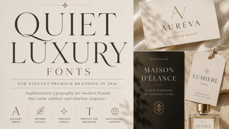
Quiet Luxury Fonts for Elegant Branding in 2026
Quiet luxury fonts are becoming an appealing choice for brands that want to communicate sophistication without relying on excessive decoration. Instead of dramatic visual effects, this typography direction focuses on refined letterforms, balanced proportions, thoughtful spacing, and understated elegance.
In 2026, quiet luxury continues to influence fashion, beauty, editorial design, hospitality, packaging, and premium lifestyle branding. Typography plays an important role in this aesthetic because even a simple wordmark can communicate exclusivity when the typeface is carefully selected.
For designers, the goal is not simply to choose an expensive-looking font. The typography should create a sense of confidence through restraint.
What Are Quiet Luxury Fonts?
Quiet luxury fonts are typefaces that communicate sophistication in a subtle and controlled way.
They are often characterized by:
- Elegant proportions
- Refined serif details
- Clean letterforms
- Generous spacing
- Balanced contrast
- Minimal decoration
- Timeless character
The term does not describe one official font classification.
Instead, it refers to the visual personality created by typography.
Both serif and sans serif typefaces can communicate quiet luxury when used appropriately.
Why Quiet Luxury Fonts Are Popular in 2026
For many years, luxury branding often relied on highly recognizable visual signals such as dramatic serif fonts, monograms, metallic finishes, and elaborate packaging.
Modern premium branding can take a more restrained approach.
Instead of communicating luxury through decoration, brands can use simplicity, materials, photography, typography, and spacing to establish value.
This makes typography particularly important.
When a visual identity contains fewer elements, every detail of the typeface becomes more noticeable.
The Rise of Understated Luxury Branding
Understated branding focuses on confidence rather than visual excess.
A premium identity may use only:
- A simple wordmark
- Neutral colors
- Refined typography
- High-quality photography
- Generous white space
This creates a very different impression from maximalist luxury.
Rather than demanding attention, the design communicates confidence through restraint.
Typography becomes one of the strongest elements of the identity.
Quiet Luxury Fonts for Logo Design
Logo design is one of the best applications for this aesthetic.
A carefully selected typeface can create an elegant wordmark without requiring an additional symbol.
Serif fonts are particularly popular because their details can introduce heritage and sophistication.
However, designers should pay close attention to:
- Kerning
- Letter spacing
- Capitalization
- Proportions
- Alternative characters
- Ligatures
Small typographic adjustments can dramatically change the personality of a logo.
For additional guidance, explore our Logo Fonts article for more ideas on choosing typography for brand identities.
Serif Fonts and Quiet Luxury
Serif typography has a long association with publishing, fashion, heritage, and premium products.
For quiet luxury branding, designers may prefer serif fonts that feel refined rather than overly decorative.
Look for characteristics such as:
- Graceful curves
- Controlled contrast
- Elegant capitals
- Refined terminals
- Balanced proportions
These qualities can create a sophisticated identity while remaining visually calm.
Our Soft Serif Fonts guide explores this gentler approach to modern serif typography in more detail.
Sans Serif Fonts for Quiet Luxury
Luxury branding does not always require serif typography.
A carefully designed sans serif can create an equally sophisticated result.
Minimal sans serif fonts work particularly well for brands that want to communicate:
- Modernity
- Precision
- Confidence
- Simplicity
- Contemporary luxury
The key is often spacing.
Generous tracking combined with clean letterforms can transform relatively simple typography into a premium visual system.
Quiet Luxury Fonts for Fashion Branding
Fashion is one of the strongest environments for understated typography.
A fashion identity may use an elegant wordmark with minimal supporting graphics.
The typography can appear across:
- Clothing labels
- Lookbooks
- Campaigns
- Websites
- Packaging
- Social media
- Editorial layouts
Serif fonts can create a more editorial personality, while clean sans serif typography can communicate modern minimalism.
The right choice depends on the positioning of the fashion brand.
Typography for Beauty Brands
Beauty and skincare branding also works naturally with quiet luxury typography.
These brands often need to communicate premium quality while maintaining softness and accessibility.
Elegant serif typography can work beautifully for:
- Product names
- Logos
- Packaging
- Advertising
- Website headlines
Neutral sans serif fonts can then handle ingredients, product information, and supporting text.
For more inspiration, see our Best Fonts for Beauty Brand Logos guide.
Quiet Luxury Typography in Packaging
Packaging is where understated typography can become particularly effective.
Instead of filling every surface with graphics, designers can use a simple typographic hierarchy.
For example:
Brand Name
Product Name
Short Description
Essential Information
When combined with high-quality materials, subtle printing techniques, and generous spacing, typography can communicate premium quality without excessive decoration.
This works especially well for:
- Perfume
- Cosmetics
- Skincare
- Candles
- Jewelry
- Premium food
- Lifestyle products
The Importance of White Space
Quiet luxury typography is not only about the font itself.
The space around the typography is equally important.
Generous white space can make a wordmark or headline feel more intentional.
It allows individual letterforms to become more noticeable.
Instead of competing with many visual elements, typography has room to communicate its personality.
This is one reason understated branding can feel premium even when the design appears relatively simple.
Quiet Luxury Fonts and Editorial Design
Editorial design provides another natural environment for refined typography.
Large serif headlines combined with restrained layouts can create a sophisticated magazine-inspired aesthetic.
This approach works particularly well for:
- Fashion
- Architecture
- Interior design
- Beauty
- Culture
- Lifestyle publications
Typography can establish the visual tone before the reader even begins the article.
Our Editorial Fonts guide explores additional typography styles for magazine and publication design.
Quiet Luxury vs Old Money Typography
Quiet luxury and old money aesthetics share some characteristics, but they are not exactly the same.
Quiet Luxury
Often feels:
- Minimal
- Contemporary
- Refined
- Restrained
- Sophisticated
Old Money Typography
Often feels:
- Traditional
- Heritage-inspired
- Classic
- Established
- Historical
Quiet luxury can look extremely modern.
Old money branding usually relies more heavily on historical visual references.
Both can communicate premium positioning, but they do so differently.
Quiet Luxury vs Maximalist Typography
Quiet luxury is also very different from maximalist typography.
Maximalism uses visual abundance to attract attention.
It may feature:
- Oversized typography
- Multiple fonts
- Bright colors
- Layered elements
- Dramatic compositions
Quiet luxury uses restraint.
The visual impact comes from precision rather than volume.
Neither approach is inherently better. They simply communicate different personalities.
Font Pairing for Quiet Luxury Branding
One of the strongest combinations is:
Elegant Serif + Neutral Sans Serif
Use the serif for:
- Logo
- Headlines
- Product names
- Editorial titles
Use the sans serif for:
- Body text
- Navigation
- Product information
- Captions
This creates contrast while maintaining a clean visual system.
Our Font Pairings for Luxury Branding article explores more combinations for premium visual identities.
Uppercase vs Lowercase Luxury Typography
Capitalization can significantly change the personality of a brand.
Uppercase
Uppercase typography can feel:
- Confident
- Established
- Structured
- Formal
Lowercase
Lowercase typography can feel:
- Contemporary
- Soft
- Approachable
- Minimal
Neither choice automatically creates luxury.
The effectiveness depends on the typeface, spacing, and overall brand system.
Our Lowercase Typography guide explores how lowercase wordmarks are being used in contemporary branding.
How to Choose Quiet Luxury Fonts
Before selecting a typeface, consider the personality of the brand.
Look at the Letterforms
Pay attention to the brand name itself.
Certain characters may become important visual elements.
Test Different Spacing
Luxury typography often benefits from carefully controlled letter spacing.
Check the Font Family
Multiple weights and italics provide greater flexibility.
Explore OpenType Features
Alternative glyphs and ligatures can help create a more distinctive wordmark.
Consider Multilingual Support
International brands should ensure the typeface supports the required languages.
Check Licensing
Always make sure the font license covers the intended commercial applications.
Common Mistakes to Avoid
Quiet luxury may look simple, but simplicity makes mistakes easier to notice.
Avoid:
- Excessively wide letter spacing
- Using several competing fonts
- Choosing decorative typography without purpose
- Copying established luxury brands too closely
- Ignoring kerning
- Sacrificing readability for elegance
Every typographic decision should feel intentional.
Quiet Luxury Fonts in Web Design
Websites can also benefit from understated typography.
A large serif headline combined with clean navigation and generous spacing can create a premium digital experience.
Designers should keep the typography system relatively simple.
For example:
One display serif for headlines.
One neutral sans serif for interface elements and body copy.
This is often enough to create a strong hierarchy.
Quiet Luxury Typography in the Age of AI
As automated design tools make polished layouts easier to produce, subtle creative decisions can become increasingly important.
Choosing a typeface is only the beginning.
Kerning, hierarchy, spacing, scale, photography, materials, and composition all contribute to the final identity.
This makes quiet luxury particularly interesting.
Its apparent simplicity requires careful attention to details that automated templates may not always capture.
What This Trend Means for Font Designers
Quiet luxury creates opportunities for type designers to develop families that combine elegance with versatility.
Useful characteristics can include:
- Refined capitals
- Beautiful italics
- Alternative characters
- Elegant ligatures
- Multiple weights
- Strong multilingual support
Designers can also create fonts that work across both large editorial headlines and smaller branding applications.
Professional type libraries such as Adobe Fonts can also be useful for studying how serif structure, proportions, weight, and spacing influence the perception of premium typography.
The Future of Quiet Luxury Typography
Trends will continue to change, but understated typography has qualities that extend beyond short-term fashion.
Strong proportions, careful spacing, readability, and elegant details are fundamental principles of good typography.
This gives quiet luxury branding the potential to age more gracefully than visual identities built entirely around temporary effects.
Brands can still evolve their photography, colors, and campaigns while maintaining a strong typographic foundation.
Final Thoughts
Quiet luxury fonts demonstrate that premium branding does not need to be loud.
Elegant letterforms, careful spacing, restrained layouts, and thoughtful typography can communicate confidence without excessive decoration.
In 2026, this approach is particularly relevant for fashion, beauty, editorial, hospitality, lifestyle, and premium product branding.
For designers, quiet luxury is ultimately less about following a specific aesthetic and more about mastering details.
For font designers, it creates opportunities to build refined typefaces where every curve, serif, proportion, and spacing decision contributes to the overall personality.
Sometimes the most luxurious typography is the typography that does not need to prove it.