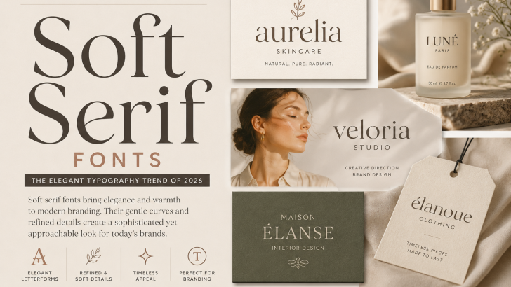
Soft Serif Fonts: The Elegant Typography Trend of 2026
Soft serif fonts are becoming an appealing choice for brands that want typography to feel elegant without appearing overly formal. With gentle curves, refined details, and graceful proportions, these typefaces can create visual identities that feel sophisticated, warm, and contemporary.
In 2026, this softer approach to serif typography fits naturally with beauty, fashion, lifestyle, editorial, wellness, and premium branding. Instead of dramatic letterforms with extremely sharp contrast, designers are exploring serif styles that combine elegance with a more approachable personality.
For designers searching for an alternative to minimalist sans serif typography, the soft serif offers an interesting balance between classic character and modern simplicity.
What Are Soft Serif Fonts?
Soft serif fonts are serif typefaces characterized by gentle shapes and a relatively approachable visual personality.
Although every typeface is different, common characteristics can include:
- Smooth curves
- Refined serifs
- Graceful proportions
- Moderate stroke contrast
- Rounded details
- Elegant lowercase forms
- Comfortable readability
The word “soft” does not refer to one formal font classification. Instead, it describes the overall visual feeling of the typography.
Some designs may lean toward modern serif structures, while others borrow characteristics from editorial or humanist typography.
Why Soft Serif Fonts Are Trending in 2026
For years, many contemporary brands relied heavily on geometric sans serif fonts.
Their simplicity made them practical for digital environments, but widespread adoption also created many similar-looking identities.
Serif typography provides another way to introduce personality.
The softer serif direction is particularly useful because it can communicate sophistication without making a brand feel excessively traditional.
It creates a middle ground between minimal modern typography and highly decorative luxury type.
The Shift Toward Softer Branding
Modern branding does not always need to appear bold or aggressive to attract attention.
Some brands are moving toward quieter visual identities built around thoughtful typography, subtle colors, natural photography, and generous spacing.
Soft serif typography fits naturally into this environment.
Its character can communicate qualities such as:
- Elegance
- Warmth
- Confidence
- Sophistication
- Calmness
- Craftsmanship
This makes the style particularly versatile for lifestyle-oriented businesses.
Soft Serif Fonts for Logo Design
One of the strongest applications for this typography style is logo design.
Serif wordmarks can create distinctive identities without requiring complex symbols.
A designer might customize:
- Letter spacing
- Individual terminals
- Ligatures
- Capital letters
- Alternative characters
Small modifications can transform a typeface into a more recognizable wordmark.
Soft serif fonts can work especially well for beauty, fashion, interior, wellness, and creative businesses.
For more guidance on choosing typography for a wordmark, explore our Logo Fonts guide.
Soft Serif Typography for Beauty Brands
Beauty branding is particularly compatible with softer serif styles.
Beauty companies often need to balance premium positioning with warmth and accessibility.
A highly dramatic fashion serif can sometimes feel too formal, while a geometric sans serif may feel too neutral.
A softer serif can sit between these extremes.
It can work effectively across:
- Logos
- Cosmetic packaging
- Product names
- Advertising
- Websites
- Social media
Our Best Fonts for Beauty Brand Logos guide explores additional typography approaches for this industry.
Serif Fonts for Fashion Branding
Fashion brands have a long relationship with serif typography.
High-contrast serifs can create a dramatic editorial personality, but softer designs offer another direction.
Gentle curves and refined proportions can make fashion typography feel sophisticated while maintaining a contemporary personality.
These fonts can work for:
- Fashion labels
- Lookbooks
- Editorial campaigns
- Websites
- Packaging
- Brand presentations
Large serif headlines combined with clean photography can produce particularly strong results.
Soft Serif Fonts in Editorial Design
Editorial typography requires a balance between personality and readability.
Serif typefaces naturally have a strong connection with books, magazines, and publishing.
Modern soft serifs can reinterpret that tradition for contemporary editorial layouts.
They can be used for:
- Magazine headlines
- Feature titles
- Pull quotes
- Cover typography
- Digital publications
When paired with a neutral sans serif, they can create a clear and elegant hierarchy.
For more ideas, see our Editorial Fonts guide.
Soft Serif Typography for Luxury Branding
Luxury typography is often associated with dramatic contrast and extremely refined letterforms.
However, modern luxury branding can also take a quieter approach.
Instead of appearing exclusive through visual excess, brands can communicate premium quality through simplicity, materials, spacing, and carefully selected typography.
A soft serif can contribute to this understated aesthetic.
It may work particularly well for:
- Skincare
- Perfume
- Jewelry
- Boutique hotels
- Interior brands
- Premium lifestyle products
For additional inspiration, explore our Font Pairings for Luxury Branding guide.
Soft Serif Fonts vs High-Contrast Serifs
Not all elegant serif typography creates the same impression.
Soft Serif Typography
It can feel:
- Warm
- Gentle
- Refined
- Contemporary
- Approachable
High-Contrast Serif Typography
It can feel:
- Dramatic
- Fashion-forward
- Formal
- Luxurious
- Editorial
Both styles can create premium identities.
The correct choice depends on the personality a brand wants to communicate.
Soft Serif vs Sans Serif
Sans serif fonts remain an excellent choice for clean and functional branding.
However, a serif can introduce additional visual character.
A neutral sans serif often communicates simplicity and efficiency.
A softer serif may communicate sophistication and warmth.
Designers do not necessarily need to choose one or the other.
Combining them can create an effective typography system.
Pairing Soft Serif Fonts With Sans Serif
One of the easiest combinations is:
Soft Serif + Clean Sans Serif
Use the serif for:
- Logos
- Headlines
- Product names
- Editorial titles
Use the sans serif for:
- Body copy
- Navigation
- Product information
- Captions
The contrast allows the serif to establish personality while the sans serif handles functional information.
Soft Serif Fonts for Packaging
Packaging is another natural application.
Typography can communicate the personality of a product before customers read the details.
A refined serif can help packaging feel premium without requiring complicated decoration.
This approach can work particularly well for:
- Skincare
- Cosmetics
- Coffee
- Candles
- Food
- Fragrance
- Lifestyle products
Combine the typography with thoughtful spacing and a restrained visual system for a more sophisticated result.
Soft Serif Typography in Web Design
Serif fonts are increasingly comfortable in digital environments when carefully selected and implemented.
Large serif headlines can give websites stronger personality while neutral typography handles navigation and longer text.
Soft serif styles are particularly useful for websites that want to feel:
- Editorial
- Premium
- Calm
- Artistic
- Sophisticated
Designers should test the typeface at multiple screen sizes to ensure that fine details remain clear.
Soft Serif Fonts and Lowercase Branding
Lowercase typography can make serif branding feel even softer.
Instead of using dramatic uppercase wordmarks, brands may use lowercase letters to create a quieter personality.
This combination can feel particularly suitable for:
- Beauty
- Wellness
- Lifestyle
- Interior design
- Fashion
- Creative studios
It also connects with the broader Lowercase Typography trend, where brands use restrained capitalization to communicate approachability.
Soft Serif Fonts and the Human Touch
Many softer serif designs contain subtle characteristics influenced by traditional writing and calligraphy.
These details can introduce a sense of human character.
This does not mean the typography needs to look handwritten.
Even small details in curves, terminals, and proportions can make a digital typeface feel less mechanical.
This direction connects naturally with Humanist Fonts and the wider movement toward more human-centered visual identities.
How to Choose Soft Serif Fonts for Branding
Before choosing a typeface, consider several factors.
Brand Personality
Determine whether the brand should feel elegant, warm, artistic, traditional, or contemporary.
Readability
Test the font at both large and small sizes.
Character Set
Look at important letters in the brand name and make sure their shapes fit the identity.
Font Family
Multiple weights and italics provide more flexibility.
OpenType Features
Ligatures and stylistic alternates can offer additional customization.
Multilingual Support
International brands should confirm that the font supports the languages required by their audience.
Common Mistakes to Avoid
Elegant typography can quickly lose its impact when overused.
Avoid:
- Using too many serif typefaces
- Setting long paragraphs in overly decorative fonts
- Using excessively tight spacing
- Choosing style over readability
- Combining several competing personalities
A simple typography system often produces the strongest result.
What Soft Serif Fonts Mean for Type Designers
For font designers, softer serif styles provide an interesting space between traditional and experimental typography.
Designers can explore:
- Rounded terminals
- Gentle curves
- Distinctive italics
- Alternative glyphs
- Elegant ligatures
- Refined contrast
A complete family with multiple weights can also give branding designers greater flexibility.
Rather than focusing only on dramatic display characteristics, type designers can develop serif families that work across logos, headlines, editorial layouts, and supporting text.
Designers can also explore professional serif collections through Adobe Fonts to study how different proportions, contrasts, and serif structures influence the personality of a typeface.
The Future of Soft Serif Typography
The renewed interest in serif typography is part of a broader movement toward more distinctive brand identities.
As visual systems become increasingly digital and automated, typography provides an important opportunity to communicate personality.
Soft serif styles offer an especially versatile solution.
They can feel modern without becoming generic, sophisticated without appearing excessively formal, and expressive without sacrificing elegance.
Final Thoughts
Soft serif fonts demonstrate that elegance does not need to feel cold or overly formal.
Their gentle curves, refined proportions, and subtle personality make them suitable for a wide range of contemporary branding applications.
In 2026, this typography direction is particularly relevant for beauty, fashion, editorial, lifestyle, wellness, and premium brands looking for a balance between sophistication and warmth.
For designers, the style offers an alternative to both neutral sans serifs and highly dramatic luxury typography.
For font creators, it provides an opportunity to develop serif families with elegance, versatility, and a more human personality.
Sometimes the smallest details in a letterform are what give a brand its strongest voice.