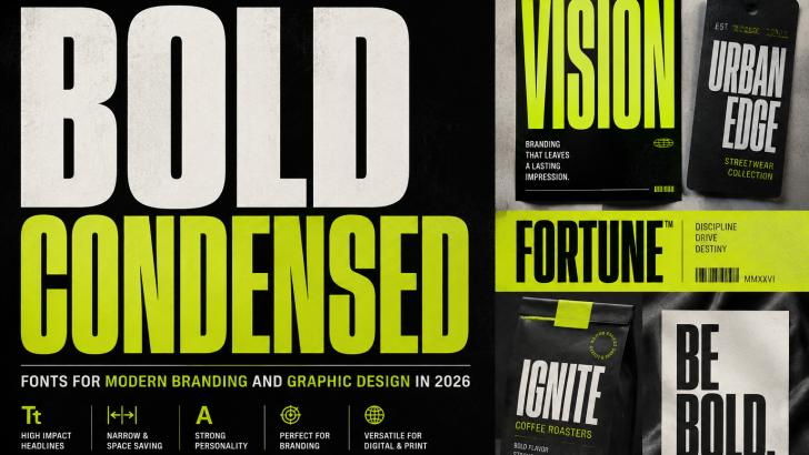
Bold condensed fonts are becoming a powerful choice for designers who want typography that feels confident, compact, and impossible to ignore. With narrow proportions and strong letterforms, these typefaces can create dramatic headlines without requiring excessive horizontal space.
In 2026, condensed typography fits naturally into the growing interest in oversized type, expressive branding, editorial layouts, posters, and typography-led visual identities.
From fashion campaigns and sports graphics to packaging and websites, condensed fonts give designers a practical way to combine visual impact with efficient use of space.
What Are Bold Condensed Fonts?
Bold condensed fonts are typefaces with relatively narrow letterforms and heavier stroke weights.
Compared with standard-width typography, condensed letters occupy less horizontal space. This allows designers to create large headlines even when the available layout width is limited.
Their common characteristics include:
- Narrow proportions
- Heavy weights
- Strong vertical forms
- Compact spacing
- High visual impact
- Distinctive headlines
These qualities make them particularly effective for display typography.
Why Bold Condensed Fonts Are Popular
Modern graphic design increasingly uses typography as a dominant visual element.
Instead of placing a small headline above a large photograph, designers can make the headline itself the primary graphic.
Condensed type works particularly well for this approach.
Because the letters are narrow, designers can dramatically increase the font size while fitting more characters into the composition.
The result can feel bold without requiring an extremely wide canvas.
Condensed Typography and Oversized Headlines
Oversized typography continues to influence branding, websites, editorial layouts, and advertising.
Condensed typefaces make this approach easier.
A headline can fill almost the entire vertical space of a poster while remaining relatively compact horizontally.
Designers can use this technique for:
- Magazine covers
- Posters
- Website hero sections
- Advertising
- Social media graphics
- Product campaigns
Typography becomes part of the composition rather than simply sitting inside it.
Bold Condensed Fonts for Logo Design
Condensed fonts can create powerful wordmarks.
Their narrow proportions can make brand names feel taller, stronger, and more distinctive.
This style can work particularly well for:
- Fashion labels
- Sports brands
- Restaurants
- Creative studios
- Automotive projects
- Entertainment
- Lifestyle businesses
However, the typeface should match the personality of the brand.
A heavy industrial condensed font communicates something very different from an elegant narrow serif.
For additional logo inspiration, explore our Logo Fonts guide for more ideas on selecting typography for memorable brand identities.
Condensed Fonts for Fashion Branding
Fashion is one area where condensed typography can create strong visual impact.
Tall letterforms can feel editorial, contemporary, and confident.
Designers can use them across:
- Lookbooks
- Campaign posters
- Websites
- Packaging
- Clothing-related editorial graphics
- Social media campaigns
Condensed typography can also create an interesting contrast with elegant serif fonts.
A narrow sans serif may handle large headlines while a sophisticated serif provides supporting editorial text.
Bold Typography in Sports Design
Sports graphics often require typography that communicates energy and strength.
Heavy condensed fonts are particularly effective because they can create powerful headlines while leaving room for photography, statistics, logos, and other information.
They can work for:
- Team graphics
- Event posters
- Social media
- Score graphics
- Promotional campaigns
- Fitness branding
Strong uppercase condensed typography can create an immediate sense of intensity.
Bold Condensed Fonts in Poster Design
Poster design is one of the natural homes of condensed typography.
A designer can stack multiple words vertically, creating a strong typographic block.
For example:
CREATIVE
DESIGN
FUTURE
With a narrow typeface, each line can appear extremely large without becoming too wide.
This technique works particularly well when combined with strong contrast and simple supporting graphics.
Condensed Typography in Editorial Design
Editorial designers frequently need to balance typography with photography and other content.
Condensed fonts provide additional flexibility.
A narrow headline can sit beside an image without occupying too much horizontal space.
This is useful for:
- Magazine covers
- Feature articles
- Newspapers
- Digital publications
- Creative catalogs
For more editorial inspiration, our Editorial Fonts and Magazine Fonts guides explore additional typography styles for publication design.
Bold Condensed Fonts for Packaging
Packaging often has limited space.
A product name may need to compete with descriptions, ingredients, illustrations, logos, and regulatory information.
Condensed typography can help designers create prominent product names without consuming the entire layout.
This works especially well for:
- Coffee
- Food
- Cosmetics
- Lifestyle products
- Creative packaging
- Personal care products
The typography can become a recognizable part of the packaging system.
Condensed Serif Fonts
Condensed typography is not limited to sans serif typefaces.
Narrow serif fonts can create a completely different personality.
They may feel:
- Editorial
- Elegant
- Dramatic
- Sophisticated
- Fashion-oriented
A high-contrast condensed serif can work beautifully for magazine headlines, beauty branding, and luxury packaging.
Designers looking for elegant alternatives can explore our Modern Serif Fonts guide.
Condensed Sans Serif Fonts
Sans serif condensed fonts tend to feel stronger and more contemporary.
Depending on their construction, they can communicate:
- Confidence
- Industrial character
- Modernity
- Energy
- Minimalism
They are commonly used in posters, sports graphics, advertising, and modern brand identities.
Heavy weights create stronger impact, while lighter condensed styles can feel more refined.
Condensed vs Extended Typography
Condensed and extended fonts create opposite visual effects.
Condensed Fonts
Narrow typography feels:
- Compact
- Tall
- Efficient
- Strong
- Vertical
Extended Fonts
Wide typography can feel:
- Expansive
- Futuristic
- Stable
- Horizontal
- Spacious
Designers can even combine the two styles to create dramatic contrast.
For example, a condensed headline paired with a wide supporting word can produce a highly expressive composition.
Bold Condensed Fonts and Maximalist Design
Condensed type fits naturally into maximalist typography.
Large letters, dramatic scale, layered compositions, and dense layouts can all benefit from narrow typefaces.
A designer might stretch a condensed headline across the height of a poster while layering photography behind or in front of the text.
This creates visual tension without requiring many separate graphic elements.
Our Maximalist Typography guide explores this expressive approach in more detail.
Condensed Typography for Social Media
Social media designs need to communicate quickly.
Large typography can help important words remain visible even on small screens.
Condensed fonts allow designers to make headlines larger while keeping them inside vertical mobile layouts.
They can work particularly well for:
- Announcements
- Promotions
- Event graphics
- Product launches
- Quotes
- Fashion campaigns
Short, powerful headlines usually produce the strongest results.
Bold Condensed Fonts in Web Design
Websites increasingly use large typography in hero sections.
Condensed type can create dramatic headlines while leaving room for navigation, imagery, and calls to action.
For example, a creative studio might use a headline occupying almost the entire screen:
DESIGN
WITHOUT
LIMITS
The narrow proportions allow each word to become extremely large.
This can create a strong first impression while maintaining a relatively simple layout.
Pairing Condensed Fonts With Serif Fonts
Condensed sans serif fonts can work beautifully with serif typography.
The condensed font provides impact.
The serif provides elegance and readability.
This combination is particularly useful for:
- Editorial design
- Fashion
- Beauty
- Creative branding
- Premium packaging
Contrast between the two typefaces creates visual hierarchy.
Pairing Condensed Fonts With Neutral Sans Serifs
Another approach is to combine an expressive condensed display font with a neutral sans serif.
Use the condensed font for:
- Headlines
- Logos
- Product names
- Campaign messages
Use the neutral font for:
- Body text
- Navigation
- Product descriptions
- Supporting information
This keeps the design expressive while maintaining readability.
How to Choose Bold Condensed Fonts
Before choosing a condensed typeface, consider the intended application.
Readability
Extremely narrow fonts can become difficult to read at small sizes.
Weight
Heavy weights create more impact but may reduce clarity in dense layouts.
Character
Look closely at distinctive letters and numerals.
Font Family
Multiple weights provide more flexibility for branding systems.
Language Support
International projects should confirm that all necessary characters are available.
The best font balances visual personality with practical functionality.
Common Mistakes to Avoid
Condensed typography can be powerful, but it should be used carefully.
Avoid:
- Using extremely narrow fonts for long paragraphs
- Creating excessively tight spacing
- Using too many heavy fonts together
- Ignoring readability on mobile devices
- Making every piece of text oversized
A condensed display typeface is usually strongest when contrasted with simpler supporting typography.
What Bold Condensed Fonts Mean for Type Designers
For type designers, condensed families create interesting technical and creative challenges.
Letters need to become narrower without losing their identity.
Designers must carefully consider:
- Counter shapes
- Stroke weight
- Spacing
- Readability
- Proportions
- Character recognition
A well-designed condensed family should feel intentionally narrow rather than simply compressed.
Variable font technology can provide even greater possibilities by allowing users to adjust width dynamically.
For more information about flexible type systems, explore our Variable Fonts guide.
Designers can also study professional condensed type families through Adobe Fonts to understand how different widths, weights, and proportions influence typography.
Final Thoughts
Bold condensed fonts provide designers with an effective combination of impact and efficiency.
Their narrow proportions allow typography to become larger, stronger, and more visually dominant without requiring excessive horizontal space.
In 2026, this makes condensed typography particularly relevant for posters, editorial layouts, websites, branding, packaging, sports graphics, and social media.
For brands, condensed type can create confident and recognizable identities. For type designers, it offers opportunities to explore proportion, weight, and visual rhythm.
Sometimes the most powerful typography does not need more space. It simply needs to use the available space differently.