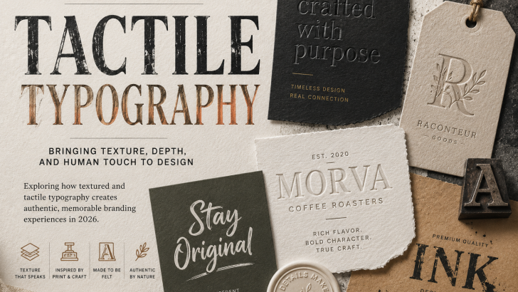
Tactile Typography: The Textured Design Trend of 2026
Tactile typography is bringing texture, depth, and physical character back into modern graphic design. Instead of relying only on perfectly smooth digital letterforms, designers are exploring typography inspired by paper, ink, embossing, printing, handmade processes, and other material qualities.
In 2026, this approach feels especially relevant as digital design becomes increasingly polished and automated. Texture can make typography feel more distinctive, expressive, and connected to the physical world.
From packaging and posters to branding and editorial design, tactile type offers designers another way to transform simple words into memorable visual experiences.
What Is Tactile Typography?
Tactile typography is a design approach that gives type a sense of physical texture or material presence.
The effect can be created physically or digitally.
Common techniques include:
- Embossed lettering
- Letterpress effects
- Paper textures
- Ink imperfections
- Grain
- Distressed surfaces
- Hand-painted letters
- Cut-paper typography
- Metallic finishes
- Three-dimensional type
These techniques make typography feel less flat and more connected to physical materials.
Why Tactile Typography Is Trending in 2026
Digital design tools make it easy to create extremely clean graphics.
Perfect gradients, smooth vectors, precise layouts, and polished typography can now be produced quickly.
As this visual perfection becomes more common, texture provides contrast.
Small imperfections, material details, and physical-looking surfaces can give typography more personality.
This does not mean digital design is disappearing. Instead, designers are combining digital precision with inspiration from analog materials.
The Return of Physical Texture
Physical design processes have always influenced typography.
Letterpress printing, screen printing, painted signs, stamps, book covers, and packaging all produce unique visual characteristics.
Ink may spread slightly.
Paper may have visible fibers.
Printed letters may contain small imperfections.
These details can make typography feel more tactile and individual.
Modern designers can reproduce these qualities digitally or incorporate real materials into their creative process.
Tactile Typography and Modern Branding
Brands are constantly looking for ways to become more recognizable.
A distinctive typeface is important, but the way typography is presented can also become part of a visual identity.
Texture can help communicate qualities such as:
- Craftsmanship
- Authenticity
- Creativity
- Premium quality
- Personality
- Heritage
This makes tactile typography particularly interesting for brands that want to create a strong sensory impression.
Textured Typography for Logo Design
Logo systems are usually designed to remain simple and flexible, but textured treatments can become useful secondary brand elements.
For example, a clean wordmark might appear with an embossed treatment on packaging or a letterpress effect on stationery.
This allows brands to maintain a recognizable logo while creating richer physical experiences.
Designers exploring typography-based identities can also read our Logo Fonts guide for more ideas on choosing distinctive typefaces for wordmarks.
Tactile Typography in Packaging Design
Packaging is one of the strongest applications for textured typography.
Unlike digital graphics, packaging is a physical object that customers can actually touch.
Designers can use techniques such as:
- Embossing
- Debossing
- Foil stamping
- Letterpress
- Specialty paper
- Raised printing
- Textured labels
These details can turn typography into part of the product experience.
Luxury products, coffee packaging, cosmetics, food, wine alternatives, and lifestyle goods can particularly benefit from carefully considered tactile details.
Embossed Typography
Embossing creates raised areas on a physical surface.
When applied to typography, it can give letters additional depth without requiring strong colors or complex graphics.
This technique works especially well with minimalist packaging because light and shadow become part of the design.
Elegant serif fonts, clean sans serifs, and simple display typography can all work effectively with embossed treatments.
Letterpress-Inspired Typography
Letterpress printing has a distinctive physical quality.
Ink, pressure, and paper interact to produce subtle variations that are difficult to replicate perfectly.
Digital designers often borrow this aesthetic through:
- Slightly distressed edges
- Ink textures
- Uneven coverage
- Paper grain
These characteristics can introduce warmth into otherwise clean typography.
Textured Fonts and Display Typography
Display fonts are particularly suitable for tactile treatments because they are usually used at larger sizes.
Large letterforms provide more space for texture to become visible.
Designers can experiment with:
- Rough surfaces
- Grain
- Ink effects
- Painted textures
- Paper effects
- Three-dimensional details
For additional inspiration, our Display Fonts guide explores how expressive typefaces can become dominant visual elements in branding and graphic design.
Tactile Typography in Editorial Design
Editorial design can also benefit from physical-looking typography.
Magazine covers, books, catalogs, and independent publications can combine expressive type with photography, paper textures, and experimental layouts.
Texture can help establish hierarchy while adding atmosphere.
A large serif headline with subtle grain, for example, may feel completely different from the same typography rendered as a perfectly clean vector.
The Connection With Imperfect Typography
Tactile design is closely related to the growing interest in imperfection.
Both approaches move away from completely sterile digital aesthetics.
However, they are not exactly the same.
Imperfect Typography focuses primarily on irregular letterforms and intentional imperfections.
Tactile design focuses more on surface, material, texture, and physical qualities.
The two approaches can work beautifully together.
A slightly irregular typeface combined with natural paper texture can create a particularly strong handmade aesthetic.
Tactile Typography and the Handmade Aesthetic
Handmade visual culture continues to provide inspiration for contemporary designers.
Painted letters, stamps, collage, cut paper, handwriting, and analog printing can all influence modern typography.
These techniques introduce small variations that make individual compositions feel unique.
This direction also connects with Handwritten Fonts, where natural movement and human character become important parts of the visual language.
Texture in Digital Branding
Tactile typography does not need to exist only in physical media.
Digital brands can simulate material qualities through:
- Grain overlays
- Paper textures
- Animated surfaces
- Three-dimensional type
- Scanned lettering
- Print-inspired effects
These elements can help websites and social media graphics feel less flat.
However, designers should use texture carefully so it does not interfere with readability or website performance.
Tactile Typography in the Age of AI
As generative tools make polished visual content easier to create, recognizable art direction becomes increasingly valuable.
Texture provides one way to introduce character.
Designers can combine modern tools with physical processes by scanning handmade lettering, photographing materials, or creating textures manually before integrating them into digital layouts.
The result does not need to reject technology.
Instead, analog and digital processes can complement each other.
How to Use Tactile Typography Effectively
Texture should support the message rather than simply decorate the design.
Consider these principles:
- Start with a readable typeface
- Use texture selectively
- Match materials to brand personality
- Maintain strong contrast
- Test designs at different sizes
- Keep important information clear
For example, a rough ink texture may work beautifully for an independent coffee brand but feel inappropriate for a highly technical corporate identity.
Context matters.
Choosing Fonts for Textured Design
Not every font reacts to texture in the same way.
Bold fonts provide larger surfaces where grain and distressed effects can remain visible.
Serif fonts can create elegant combinations with paper and embossing.
Experimental fonts can produce more artistic results.
When selecting typography, consider both the original letterforms and how they will interact with the intended material treatment.
Our Expressive Typography guide provides additional ideas for choosing fonts with stronger visual personalities.
Common Mistakes to Avoid
Tactile effects can quickly become excessive.
Avoid:
- Adding texture to every element
- Reducing readability
- Using materials unrelated to the brand
- Applying random distressed effects
- Combining too many textures
- Allowing effects to overpower typography
The strongest designs often use texture selectively.
One carefully executed material detail can have more impact than many competing effects.
What Tactile Typography Means for Font Designers
For type designers, this trend highlights the importance of character.
Fonts that work well with tactile treatments often have recognizable silhouettes and strong letterforms.
Designers can explore:
- Rough display fonts
- Organic serifs
- Handmade styles
- Ink-inspired type
- Experimental letterforms
- Alternative glyphs
Even clean digital fonts can become highly expressive when combined with the right material treatment.
Designers looking to study a wider range of professional typography can also explore Adobe Fonts, which provides examples across serif, sans serif, display, script, and other categories.
Is Tactile Typography Right for Your Brand?
Before using textured typography, consider what the brand should communicate.
Ask:
- Does physical texture support the brand story?
- Should the identity feel handmade or polished?
- Will the effect work in print and digital formats?
- Can typography remain readable?
- Does the material treatment add meaningful character?
If texture reinforces the brand personality, it can become a powerful visual asset.
Final Thoughts
Tactile typography shows how type can become more than a flat digital element.
Through texture, material, printing techniques, and physical inspiration, designers can give typography a stronger sense of depth and personality.
In 2026, this approach provides an interesting counterpoint to increasingly polished digital content.
For brands, tactile type can communicate craftsmanship and create memorable visual experiences. For font designers, it offers new opportunities to explore how letterforms interact with texture and material.
The future of typography may be increasingly digital, but some of its most compelling ideas still come from things we can see, feel, print, and touch.