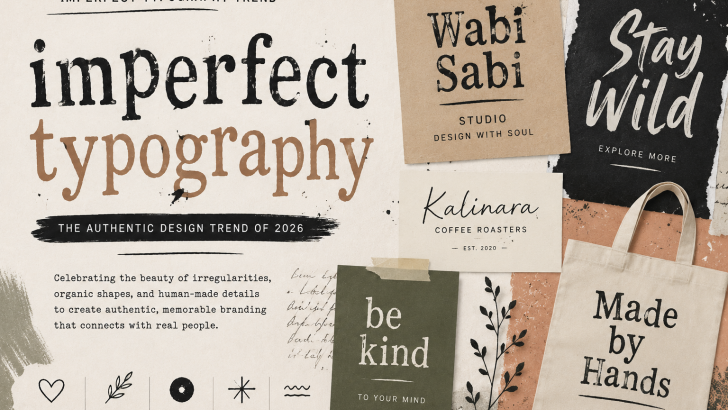
Imperfect Typography: The Authentic Design Trend of 2026
Imperfect typography is emerging as a compelling direction in modern graphic design as brands look for visual identities that feel more personal, expressive, and human. Instead of perfectly polished letterforms, designers are exploring irregular shapes, organic details, hand-drawn influences, and unexpected typographic character.
In 2026, this approach feels particularly relevant as digital tools make flawless visual content easier to produce. Deliberate imperfection can introduce personality and help a brand move away from generic visual systems.
For designers, the goal is not to create bad typography. It is to use imperfection intentionally to communicate character.
What Is Imperfect Typography?
Imperfect typography describes an approach where letterforms intentionally include irregular or organic characteristics.
These details may include:
- Uneven edges
- Irregular proportions
- Hand-drawn shapes
- Natural stroke variations
- Unusual spacing
- Distressed details
- Unexpected curves
Unlike highly geometric typography, imperfect letterforms do not always appear mathematically precise.
That difference can become part of their personality.
Why Imperfect Typography Is Relevant in 2026
Modern design software makes precision easy.
Designers can create perfectly aligned layouts, consistent spacing, smooth shapes, and highly polished graphics faster than ever.
Generative tools have accelerated this process even further.
As polished content becomes increasingly common, creative direction becomes an important way to differentiate a brand.
Organic typography can introduce visual details that feel intentional, individual, and less standardized.
The Shift From Perfect to Personal
For years, digital branding has been dominated by clean visual systems.
Minimal logos, geometric sans serif fonts, structured grids, and neutral layouts became common across many industries.
These approaches remain effective, but widespread adoption can create visual similarity.
Designers are therefore exploring typography with more personality.
An unusual letter, imperfect curve, or unexpected detail can make a simple wordmark much more recognizable.
Imperfect Typography and Human-Centered Design
One reason this aesthetic is interesting is its connection with human-centered visual communication.
Natural handwriting is rarely perfectly consistent.
Hand-painted signs, printed materials, sketches, and physical lettering often contain small variations.
Bringing similar qualities into digital typography can create a subtle sense of human presence.
This direction connects naturally with the growing interest in Humanist Fonts and Handwritten Fonts, where organic characteristics are used to create warmer visual identities.
Organic Letterforms in Modern Branding
Organic typography does not necessarily need to look handmade.
A professionally designed digital typeface can still contain unusual shapes, asymmetry, or subtle irregularities.
These details can help communicate:
- Creativity
- Authenticity
- Individuality
- Warmth
- Independence
The result can feel contemporary while avoiding the sterile appearance sometimes associated with overly standardized branding.
Imperfect Typography for Logo Design
Logo design is one of the strongest applications for this style.
A distinctive letterform can become a recognizable part of a wordmark.
Designers may experiment with:
- Custom ligatures
- Uneven letter widths
- Modified terminals
- Alternative characters
- Unusual kerning
- Hand-drawn details
Even one customized character can transform a relatively simple logo.
The key is maintaining enough clarity for the brand name to remain recognizable.
For more logo typography ideas, readers can explore our Logo Fonts guide for different approaches to creating distinctive wordmarks.
The Rise of Organic Fonts
Organic fonts often take inspiration from physical processes and natural movement.
Some may resemble brush strokes or handwriting, while others use irregular serif details or unusual proportions.
This category can include:
- Hand-drawn fonts
- Experimental serif fonts
- Brush fonts
- Rough display fonts
- Decorative typefaces
- Irregular sans serif fonts
The visual style can range from subtle imperfection to highly expressive experimentation.
Imperfect Serif Fonts
Serif typography offers particularly interesting possibilities.
Traditional serif structures can be combined with unusual details to create a balance between familiarity and personality.
An imperfect serif might feature irregular terminals, expressive contrast, unexpected curves, or slightly unconventional proportions.
These styles can work well for:
- Editorial branding
- Fashion
- Beauty
- Packaging
- Creative studios
- Lifestyle brands
Designers looking for a cleaner alternative can compare this direction with Modern Serif Fonts.
Imperfect Display Fonts
Display fonts allow designers to push experimentation further.
Because they are primarily intended for large sizes, their letterforms can carry more distinctive characteristics.
They are particularly effective for:
- Posters
- Headlines
- Packaging
- Album artwork
- Social campaigns
- Fashion graphics
This connects closely with the broader Expressive Typography movement, where type becomes a central visual element rather than simply supporting other graphics.
Imperfect Typography in Packaging
Packaging is an ideal environment for typography with personality.
Products compete for attention both on physical shelves and online stores.
Organic lettering can help communicate a handcrafted or independent character.
It can work particularly well for:
- Coffee
- Food
- Cosmetics
- Candles
- Natural products
- Lifestyle goods
- Independent brands
The typography should still align with the actual product positioning.
A handmade aesthetic should not be added simply because it is fashionable.
Handmade Does Not Mean Unprofessional
One misconception about imperfect design is that it must look unfinished.
Successful organic typography is usually carefully designed.
Irregularity is intentional.
Spacing still matters. Hierarchy still matters. Readability still matters.
The designer decides which rules to follow and which details to disrupt.
This distinction separates intentional imperfection from poor typography.
Imperfect Typography vs Geometric Typography
These two directions can communicate very different personalities.
Geometric Typography
Geometric fonts often communicate:
- Precision
- Technology
- Structure
- Modernity
- Efficiency
Organic Typography
More irregular letterforms can communicate:
- Personality
- Creativity
- Warmth
- Individuality
- Human character
Neither is inherently better.
A technology company may benefit from geometric precision, while an independent creative brand may prefer something more expressive.
Some visual identities can even combine both approaches.
The Influence of Print and Analog Design
Digital designers continue to draw inspiration from physical media.
Old printing techniques, screen printing, handmade posters, book covers, painted signage, and vintage packaging all contain imperfections created by materials and production methods.
Those characteristics can be recreated or reinterpreted digitally.
Texture, irregular edges, ink-like forms, and unconventional typography can give contemporary work a tactile quality.
Designers interested in exploring broader type collections and studying different approaches to letterform design can also browse established libraries such as Adobe Fonts.
Imperfect Typography in the Age of AI
AI is changing how creative content is produced.
As automated tools become capable of generating increasingly polished imagery and layouts, brands may place greater value on recognizable creative direction.
Typography can play an important role in that differentiation.
Custom letters, unusual fonts, handmade details, and intentional irregularity can create visual systems with stronger personalities.
The objective is not to make designs look anti-technology.
Instead, human characteristics can complement modern technology.
How to Use Imperfect Typography Effectively
Start with a clear purpose.
Ask what the typography should communicate before choosing an experimental style.
A few useful principles include:
- Use expressive type for important elements
- Keep body text readable
- Create clear visual hierarchy
- Limit competing font personalities
- Use irregularity consistently
- Test typography at multiple sizes
A distinctive font should strengthen communication rather than distract from it.
Common Mistakes to Avoid
Avoid treating imperfection as random decoration.
Common problems include:
- Excessive distortion
- Poor readability
- Too many experimental fonts
- Inconsistent letter treatments
- Weak hierarchy
- Using a trend that does not fit the brand
The strongest results usually come from controlled experimentation.
What This Trend Means for Font Designers
This direction creates interesting opportunities for independent type designers.
A typeface does not need perfect geometric symmetry to feel professionally crafted.
Designers can explore:
- Alternative glyphs
- Irregular serif structures
- Custom ligatures
- Organic curves
- Hand-drawn influences
- Multiple stylistic sets
OpenType features are especially useful because they allow users to introduce variation without sacrificing the functionality of a digital font.
This gives type designers room to create families that feel expressive while remaining practical for professional projects.
Is Imperfect Typography Right for Your Brand?
Before adopting the style, consider the personality of the business.
Ask:
- Should the brand feel polished or handcrafted?
- Does the audience value creativity and individuality?
- Will the typography remain readable?
- Can the style work across multiple applications?
- Does it support the brand story?
If organic characteristics reinforce the brand’s personality, imperfect typography can become a distinctive visual asset.
Final Thoughts
Imperfect typography reflects a broader desire for visual communication with more personality.
As digital design becomes increasingly polished and automated, organic letterforms, unusual details, and intentional irregularities provide designers with another way to create distinctive identities.
The trend does not reject professional design. Instead, it challenges the idea that professional typography must always look perfectly uniform.
For brands, this creates opportunities to communicate warmth and individuality. For type designers, it opens new possibilities for developing fonts with memorable character.
In 2026, the most interesting typography may not always be the most perfect. Sometimes the details that break the pattern are exactly what make a typeface memorable.