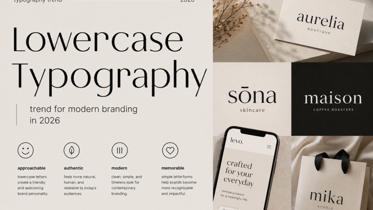
Lowercase Typography: The Branding Trend Taking Over 2026
Lowercase typography is becoming an increasingly visible part of modern branding. More businesses are embracing lowercase letters in logos, websites, packaging, and digital campaigns to create identities that feel friendly, contemporary, and approachable.
While uppercase letters often communicate strength and authority, lowercase typography can create a softer and more conversational personality.
In 2026, this simple typographic approach is becoming an interesting branding tool for businesses looking to build stronger connections with modern audiences.
What Is Lowercase Typography?
Lowercase typography refers to the intentional use of lowercase letters as a dominant element within a visual identity.
Instead of writing a brand name with traditional capitalization or using all uppercase letters, designers can use lowercase lettering to create a more relaxed appearance.
This approach is commonly seen in:
- Logo design
- Technology branding
- Fashion labels
- Beauty brands
- Lifestyle businesses
- Social media
- Product packaging
The result is often a brand identity that feels simple, contemporary, and accessible.
Why Lowercase Typography Is Trending
Modern consumers increasingly respond to brands that feel authentic and approachable.
Lowercase letters can help remove some of the formality traditionally associated with corporate branding. Instead of appearing overly authoritative, brands can communicate in a way that feels more conversational.
This is particularly relevant for businesses targeting younger audiences who often prefer visual identities that feel natural, simple, and less corporate.
Lowercase vs Uppercase Typography
Typography can dramatically change the personality of a brand. Even something as simple as capitalization can influence how people perceive a logo or visual identity.
Uppercase Typography
Uppercase letters often communicate:
- Confidence
- Authority
- Strength
- Luxury
- Formality
They are commonly used by premium fashion brands, financial companies, luxury businesses, and traditional organizations.
Lowercase Typography
Lowercase letters often communicate:
- Friendliness
- Simplicity
- Accessibility
- Creativity
- Modernity
This makes the lowercase style particularly effective for startups, lifestyle brands, creative businesses, and companies that want to appear more approachable.
Why Brands Use Lowercase Logos
A lowercase logo can make a company feel more human.
Instead of creating distance between the business and the customer, lowercase lettering can help establish a relaxed and welcoming visual tone.
This approach works especially well for brands that want to communicate:
- Community
- Innovation
- Creativity
- Accessibility
- Authenticity
However, the choice between lowercase and uppercase letters should always reflect the personality of the brand rather than simply following a design trend.
Lowercase Typography in Modern Branding
Lowercase typography can be applied across an entire brand identity, creating a consistent visual language across multiple platforms.
Logo Design
Lowercase wordmarks can create simple and memorable brand identities. The right font can make even a minimal wordmark feel distinctive.
Website Design
Large lowercase headlines can give websites a contemporary and editorial appearance.
Packaging
Lowercase fonts can make product packaging feel friendly, modern, and approachable.
Social Media
Informal typography works naturally with conversational social media content and modern digital communication.
Best Font Styles for Lowercase Branding
Choosing the right font is essential when creating a lowercase-focused visual identity.
Modern Sans Serif Fonts
Clean sans serif fonts can create simple and approachable branding. Their minimal letterforms often work beautifully in lowercase logos.
Soft Geometric Fonts
Rounded geometric letterforms can communicate friendliness and accessibility.
Minimal Serif Fonts
Modern serif fonts can bring sophistication while maintaining a relaxed personality.
Creative Display Fonts
Unique display typography can make lowercase logos more distinctive and memorable.
Lowercase Typography and Gen Z Branding
Younger audiences are influencing how brands communicate visually.
Social media culture has made informal communication increasingly common, and lowercase writing often feels natural in digital conversations.
Brands targeting younger audiences can use this aesthetic to create visual identities that feel connected to contemporary communication habits.
However, authenticity remains important. A brand should adopt lowercase typography only when it supports its overall personality and positioning.
The Role of Font Choice
Not every typeface works equally well in lowercase.
Some fonts have particularly distinctive lowercase characters, such as the letters “a,” “g,” “e,” and “r.” These details can significantly influence the personality of a wordmark.
When choosing a font, designers should examine the complete lowercase character set rather than focusing only on uppercase letters.
The shapes, proportions, spacing, and overall rhythm of the letters should work together to create a balanced visual identity.
Lowercase Typography for Logo Design
Lowercase typography can be particularly effective for wordmark logos.
Because the letterforms often have varied shapes and heights, lowercase words can create a more natural visual rhythm than all-uppercase typography.
Designers can also customize individual characters, adjust kerning, or use alternative glyphs to make the logo more distinctive.
A carefully designed lowercase wordmark can feel simple while still having a strong personality.
How to Use Lowercase Typography Effectively
When working with lowercase typography, consider the complete visual system surrounding the typeface.
Important elements include:
- Font personality
- Letter spacing
- Font weight
- Color palette
- Visual hierarchy
- Brand positioning
A simple lowercase wordmark can become highly recognizable when these elements work together consistently.
Common Mistakes to Avoid
Avoid using lowercase letters simply because the aesthetic is currently popular.
Common mistakes include:
- Choosing fonts with weak lowercase characters
- Ignoring readability
- Using informal typography for brands that require authority
- Following trends without considering brand personality
- Creating visual identities that look too similar to competitors
Typography should always support the overall brand strategy.
Is Lowercase Typography Right for Your Brand?
Before adopting this approach, consider a few important questions:
- Should your brand feel friendly or authoritative?
- Who is your target audience?
- Does this typography style reflect your brand personality?
- Will the logo remain recognizable across different applications?
The answer depends on your brand positioning and the message you want to communicate.
For a creative startup or lifestyle brand, lowercase lettering may create the perfect approachable personality. For a traditional financial institution or highly formal organization, uppercase or title case typography may be more appropriate.
Final Thoughts
Lowercase typography demonstrates how a small design decision can dramatically influence brand perception.
In 2026, brands continue to explore typography that feels more human, approachable, and authentic. Lowercase letters can support this direction by creating visual identities that feel less formal and more conversational.
For font designers, this trend also highlights the importance of carefully crafted lowercase letterforms. A typeface with beautiful lowercase characters can transform a simple wordmark into a memorable visual identity.
Whether you’re designing a logo, packaging, website, or complete branding system, lowercase typography offers a powerful way to give a brand a distinctive and approachable visual voice.