Quiet Luxury Fonts: Elegant Typography for Premium Brands
Luxury branding is changing. Modern consumers are moving away from flashy designs and embracing a more refined aesthetic known as Quiet Luxury.
Rather than using bold colors and extravagant visuals, Quiet Luxury focuses on simplicity, quality, and timeless elegance. Typography plays a major role in communicating this sophisticated style.
The right font can instantly make a brand feel premium, trustworthy, and exclusive.
What Are Quiet Luxury Fonts?
Quiet Luxury fonts are elegant typefaces designed to communicate sophistication without appearing overly decorative.
These fonts focus on:
- Simplicity
- Refinement
- Readability
- Timeless design
- Premium aesthetics
They are commonly used by luxury fashion labels, skincare brands, jewelry companies, boutique hotels, and premium lifestyle businesses.
Why Quiet Luxury Branding Is Growing
Consumers increasingly value quality over status symbols.
Brands are responding by creating visual identities that feel:
- Understated
- Elegant
- Professional
- Authentic
Typography is one of the most effective tools for achieving this aesthetic.
Characteristics of Quiet Luxury Fonts
Elegant Serif Details
Luxury serif fonts remain the foundation of quiet luxury branding.
Balanced Letterforms
Proportions are carefully designed to feel sophisticated and refined.
Minimal Ornamentation
Quiet luxury typography avoids excessive decorative elements.
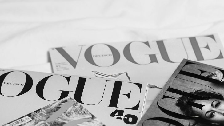
Editorial Influence
Many luxury brands borrow typography styles from fashion magazines.
Best Uses for Quiet Luxury Typography
Luxury Logo Design
Elegant typography creates memorable and premium logos.
Beauty Branding
Skincare and cosmetic brands often rely on sophisticated serif fonts.
Fashion Labels
Fashion branding benefits from timeless typography.
Luxury Packaging
Premium packaging becomes more memorable when paired with elegant fonts.
Editorial Design
Magazine-inspired layouts work beautifully with quiet luxury typefaces.
Quiet Luxury Design Trends in 2026
Several trends continue to support this aesthetic.
Minimal Branding
Simple visual systems remain highly effective.
Serif Font Revival
Elegant serif fonts continue to dominate luxury branding.
Editorial Layouts
Fashion-inspired compositions create premium experiences.
Timeless Design Systems
Brands are investing in typography that remains relevant for years.
Common Mistakes
Avoid these mistakes:
- Overly decorative typography
- Trend-driven fonts
- Excessive font combinations
- Poor readability
- Inconsistent branding
How to Choose a Quiet Luxury Font
Ask yourself:
- Does the font feel timeless?
- Does it reflect premium quality?
- Will it work across multiple platforms?
- Does it align with my brand personality?
The best quiet luxury fonts communicate confidence through simplicity.
Final Thoughts
Quiet luxury branding is more than a trend. It represents a shift toward timeless design and authentic quality.
Whether you’re building a fashion label, beauty brand, luxury hotel, or premium product line, the right typography can help communicate elegance and create lasting brand value.
A carefully selected quiet luxury font allows your brand to feel sophisticated, memorable, and effortlessly premium.