Your logo is the face of your brand. And the font you choose for it? That’s the voice.
Walk into any supermarket and you’ll recognize Coca-Cola before you’ve finished reading the label. Glance at a fashion magazine rack and Vogue’s logo needs no introduction. That instant recognition doesn’t happen by accident — it’s built on a deliberate, well-chosen typeface.
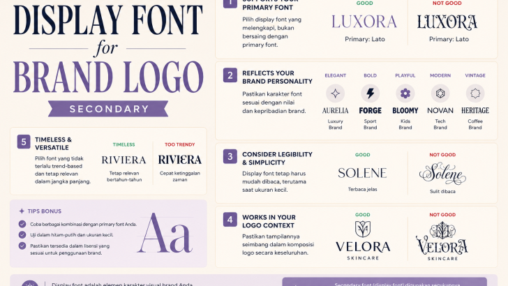
Display fonts are specifically designed to make a statement. Unlike body fonts meant for long paragraphs, display fonts are crafted for headlines, logos, and anywhere a single word or phrase needs to command attention. Choosing the right one can define how your brand is perceived for years to come.
In this guide, we’ll walk you through exactly how to choose the perfect display font for your brand logo — from understanding font personality to avoiding common mistakes that hurt brand credibility.
What Is a Display Font?
A display font is a typeface designed primarily for large sizes — think headlines, poster titles, and logos. They tend to have more personality, more decorative detail, and more expressive character than their body text counterparts.
Display fonts come in many styles:
- Serif display fonts — classic, elegant, and authoritative (think luxury fashion and editorial brands)
- Sans-serif display fonts — clean, modern, and versatile (popular with tech and lifestyle brands)
- Script display fonts — handwritten or calligraphic, warm and personal (common in wedding, beauty, and artisan brands)
- Decorative / experimental display fonts — bold, unique, and attention-grabbing (used by creative studios, streetwear, and entertainment brands)
Each style sends a different message — which brings us to the most important step.
Step 1: Define Your Brand Personality First
Before you open a single font preview, ask yourself: What feeling do I want my brand to communicate?
Font psychology is real. Research consistently shows that typefaces trigger emotional responses in viewers — and those responses influence trust, purchase intent, and brand recall.
Here’s a quick breakdown:
| Brand Personality | Font Style to Consider |
|---|---|
| Luxury, elegant, sophisticated | High-contrast serif display fonts |
| Modern, minimal, trustworthy | Geometric sans-serif display |
| Friendly, approachable, playful | Rounded or script display fonts |
| Bold, edgy, unconventional | Experimental or decorative display |
| Artisan, handcrafted, personal | Brush or calligraphic script |
For example, if you’re building a luxury skincare brand, a heavy geometric sans-serif might undermine the premium positioning you’re going for. A refined, high-contrast serif display font would communicate elegance far more effectively.
Take time with this step. The font you choose should feel like a natural extension of your brand’s values — not just a typeface that “looks nice.”
Step 2: Consider Legibility at Every Size
Display fonts are visually expressive — but they still need to be readable. This is where many brand owners go wrong.
A font that looks stunning at 200px on a designer’s monitor can become completely illegible when printed on a business card or displayed as a favicon. Before committing to a display font for your logo, test it at multiple sizes:
- Large (headline size) — website banner, signage, packaging
- Medium — email header, social media profile picture
- Small — business card, mobile screen, watermark
Pay special attention to:
Thin strokes — Very fine letterforms can disappear at small sizes or in low-resolution printing. If your logo will appear on physical products or packaging, make sure the font holds up.
Tight letter spacing — Some decorative display fonts have letters that overlap or interlock by design. Beautiful at large sizes, but potentially muddled when small.
Unique letterforms — Highly stylized letters (like an elaborate capital “G” or a flourished “y”) can confuse readers if they’re too decorative. Make sure every letter in your brand name is clearly identifiable.
Step 3: Match the Font to Your Industry Context
Fonts carry industry associations. Designers and consumers have absorbed years of visual culture, which means certain font styles “feel right” for certain industries — and others feel jarring.
This doesn’t mean you have to follow every convention. Breaking from the norm can be a powerful differentiator. But you should break rules intentionally, not accidentally.
Some general industry associations to be aware of:
Fashion & Luxury — High-contrast serifs, refined italics, elegant scripts. Think of brands like Vogue, Chanel, or Dior. These fonts signal sophistication and exclusivity.
Technology & SaaS — Clean geometric sans-serifs. They communicate clarity, efficiency, and modernity — qualities tech buyers value.
Food & Hospitality — Wide range, but warm humanist serifs and friendly rounded fonts perform well. They feel approachable and inviting.
Creative Agencies & Studios — Experimental and decorative display fonts work well here. This audience appreciates typographic boldness and originality.
Health & Wellness — Soft, organic letterforms. Rounded sans-serifs or clean scripts communicate care and calm.
If your brand sits at the intersection of two worlds — say, a luxury wellness brand or a creative tech studio — use your font choice to lean into the positioning that differentiates you most.
Step 4: Avoid the Most Common Display Font Mistakes
Even experienced designers fall into these traps. Here’s what to watch for:
Using an overexposed font — Fonts become associated with specific brands or eras through overuse. A typeface that was fresh three years ago might now feel dated or generic. If you’re seeing a font everywhere, that’s often a sign to look elsewhere.
Choosing based on personal taste alone — You’re not the target audience. The font needs to resonate with your customers, not just you. Test your options with real people if you can.
Ignoring the license — Many beautiful display fonts are free for personal use but require a commercial license for business use. Always verify licensing before using a font in your brand logo. Fonts from independent type foundries typically come with clear commercial licensing terms.
Using too many fonts — A logo with two or more display fonts usually looks unbalanced. If you want typographic contrast (say, a name in a display font and a tagline beneath it), pair your display font with a simple, understated body font — not another display font.
Skipping the context test — Always mock up your font choice in real-world contexts before deciding. Put it on a white background, a dark background, over a photo, on a tote bag, on a website hero. A font that works in isolation may not work in all the places your brand lives.
Step 5: Think About Longevity
Trends in typography move quickly. What’s fresh today can feel dated in three years.
When choosing a display font for your logo, aim for something that has a timeless quality to it — a strong, confident personality that doesn’t rely on being “on-trend” to feel relevant. The best brand typefaces feel distinctive without being trendy.
This is one reason independent type foundries are worth exploring. Unlike free font platforms, independent foundries put significant craft into each typeface — considering optical spacing, alternate characters, multilingual support, and overall refinement. The result is a font with genuine character that holds up over time.
Putting It All Together: A Quick Checklist
Before finalizing your display font choice, run through this checklist:
- Does this font reflect my brand’s personality and values?
- Is it legible at both large and small sizes?
- Does it feel appropriate (or intentionally distinct) for my industry?
- Have I checked the commercial license?
- Have I tested it in real-world mockups?
- Does it pair well with a supporting body font?
- Will it still feel relevant in five years?
If you can check all seven, you’ve found a strong contender.
Final Thoughts
Choosing a display font for your brand logo is one of the most impactful design decisions you’ll make. It sets the tone for every customer interaction, from the first time someone sees your website to the moment they open your packaging.
Take the time to explore thoughtfully — and don’t default to the first font that catches your eye. The right typeface won’t just look good. It will feel unmistakably yours.
Looking for distinctive, professionally crafted display fonts with commercial licensing? Explore the Muksalcreative type foundry — an independent font studio creating typefaces designed for branding, packaging, and digital design.