Introduction: The Rise of Anti‑Design Typography in 2025
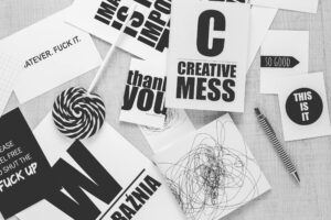
Design has rules—but in 2025, many designers are choosing to break them. Enter anti-design typography—a bold, raw, and rebellious trend that throws out traditional aesthetics in favor of chaos, contrast, and emotion.
Rather than striving for balance, symmetry, or harmony, anti-design typography embraces imperfection, misalignment, and even illegibility to make a statement. It’s not just about being different—it’s about challenging what “good design” even means.
What Is Anti‑Design Typography?
Anti-design typography is a style that deliberately goes against established design norms—especially those related to legibility, grid systems, visual hierarchy, and visual harmony.
Born out of brutalist web design and experimental graphic movements, it plays with:
-
Harsh contrasts
-
Unbalanced spacing
-
Jarring font combinations
-
Text distortion
-
Overlapping or cropped elements
It’s an act of rebellion against the “safe” minimalism that has dominated branding for years.
Why It’s Gaining Popularity in 2025
In a world saturated with polished, algorithm-optimized visuals, anti-design offers something raw and real.
Reasons behind the rise:
-
Gen-Z rebellion: Younger designers reject clean corporate visuals in favor of individuality
-
Maximalism comeback: More is more—especially in experimental digital design
-
Post-pandemic expression: Designers seek freedom and emotion over perfection
-
Attention economy: Strange, jarring layouts often stop the scroll better than clean design
🔗 External reference: Creative Bloq – Experimental Design Trends
Core Elements of Anti‑Design Fonts
Anti-design fonts don’t play by the rules. Here’s what to expect:
1. Chaotic Layouts
No alignment, no grid. Fonts might float, crash into each other, or spill off the page.
2. Extreme Contrast
Mixing ultra-thin with ultra-bold, or lowercase with uppercase. Sometimes all in the same sentence.
3. Asymmetry
Nothing is centered. Everything feels off—on purpose.
4. Discomfort as a Tool
Illegibility, distortion, or noise is part of the message. It forces the reader to pay attention (or feel something).
When to Use Anti‑Design Typography (And When Not To)
✅ Use It For:
-
Editorial layouts or posters
-
Music, streetwear, or fashion brands
-
Protest or cultural commentary
-
Experimental art projects
-
Social media posts with bold personality
❌ Avoid It For:
-
Long-form reading
-
Corporate branding (unless intentionally disruptive)
-
Formal or legal communications
-
UX-heavy websites (where legibility is priority)
It’s a style best used sparingly but intentionally.
Fonts with Anti‑Design Energy (From Muksalcreative)
Want to experiment with this trend? Try these bold, offbeat fonts from Muksalcreative:
🔹 Blockline
A brutalist sans-serif with harsh edges—great for poster-style typography.
🔹 Ramb
Bold, erratic, and loud. It’s perfect for digital rebellion.
🔹 Hauntflare
Rough, spooky, and irregular—works well in chaotic compositions.
🔹 Formatek
Futuristic but distorted in rhythm—ideal for glitchy digital aesthetics.
🔹 Graela
Combines elegance with experimental forms—a great anti-elegant option.
You May Also Like:
Final Thoughts
Anti-design typography isn’t about being messy—it’s about being meaningful in a different way. In 2025, it offers designers a creative outlet to break rules, express raw emotion, or stand out in a clean, sterile feed.
Want to try it in your next project?
👉 Explore Experimental & Brutalist Fonts at Muksalcreative